I could make this really succinct and say only: I have them all. However, that would be pointless.
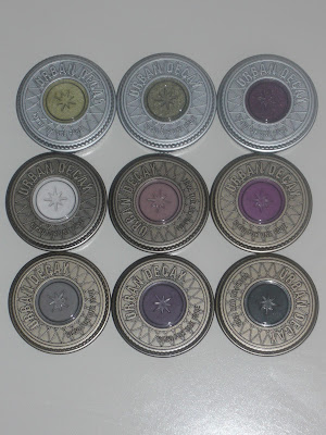
So I thought I would swatch them all for you. Simply, for the benefit of showing you how pretty they are. I think they look particularly nice in this hot pink pot, I like to keep them on display to show them off teehee.
If there is a collection of anything, I am never satisfied with just owning one or two, I have to own them all. Every book in a series, ever album by an artist and every eye shadow colour from a brand. But usually cost is an issue. Thankfully not with these, they are as cheap as chips (cringe :-S I promise you I am not a cockney)
I bought the whole range from a website called www.love-makeup.co.uk for only £2.75. I quite like this website, the layout is easy to navigate, dispatch was efficiently quick and they were delivered well wrapped in both pink tissue paper (nice touch) and bubble wrap, which I gained much joy from popping
I love to use these as a colour base to make my eye shadow colours that little bit more vivid. I can’t get away with using these pencils on their own because I have oily lids so they crease like mad or they fade away to nothingness. So I need to not only use a primer with them to stop them creasing but I also use power eye shadow to set them.
I find all of the colours to be very creamy in texture and they all glide on effortlessly. There is certainly no need to tug at your sensitive eye area with these. However, the coverage does vary, with some the application result looks so smooth and flawless they require no blending whatsoever, whereas, others require more work. Some, like Milk for example, are so pigmented to begin with, but if you try to blend them you can easily buff away the product altogether. I prefer to only blend out or shape only the edges, leaving the lids so as to have quite a bit of product for loose, or un-pigmented eye shadows to grab on to.
1. Milk 2. Cottage Cheese 3. Lavender 4. Oyster 5. Strawberry Milk 6. Yogurt
As you can see Milk is very opaque, it’s stark, flat white. As previously mentioned it blends away into practically nothingness, so it is good for the inner corner to widen the eyes and make them look more awake.
Cottage Cheese I feel is a great inner corner colour, it’s got all the great attributes of Milk but it has that lovely sheen to it that Milk lacks.
I think Lavender and Oyster are too similar, lavender is more purple toned and Oyster more pink, but for me, that isn’t enough of a difference to qualify having both in my collection. If you want a very light pink or purple, then either would work in my opinion.
Strawberry Milk is a yummy colour, but it’s for the more daring person, vivid pinks around the eye can make someone look tired or worse, ill. This would have to be used in moderation to try and avoid this.
All I can say about yogurt is that it is the perfect pink, because it’s beige pink. All the prettiness of pink with all the goodness of brown (mmm Hovis Bread)
7. Pots and Pans 8. Baby Blue 9. Pacific 10. Purple 11. Electric Blue 12. Purple Velvet
Pots and Pans: Love it! Get it! That is all
The baby blue is too bright for my taste, I barely ever use it, it washes away the little bit of colour I have left in my used-to-be-blue-now-kind-of-a-grey-tinged-green eyes.
I think pacific gives flawless results, its smooth and even and is a lovely colour, it reminds me of my favourite Barry M Fine Glitter Dust no. 5.
As you can see Purple has a blue sheen to it, which is pretty when it catches the light, but the patchy application is too noticeable.
Electric Blue is a wonderful colour and can really make your eyes pop when used on the waterline.
Purple velvet is red toned and quite dark, it is great to put on the outer corner to create depth.
13. Horse Radish 14. Lemon 15. Rocky Mountain Green 16. Gold 17. Pure Gold 18. Bronze
The grass green colour called Horse Radish is another colour that comes out smooth and flawless in application, the colour is a little too light for an all over lid cover, but great for the inner 1/3.
Lemon is more wearable, I use this colour a lot, however, it isn’t as pigmented as many of the others
Rocky Mountain Green is one of the newer shades, I’m love greens but I’m not a huge fan of this one.
Gold and Pure Gold are beautiful neutral colours, they go perfectly with blue or green eyes. They also have the best sheen out of all the other colours. They are great, a very smooth flawless colour base
Bronze is nice, but it a little too orange/red toned for my liking.
19. Black Bean 20. Dark Brown 21. Rust 22. French Fries 23. Iced Mocha
Black Bean is by far the best pencil for lining the tightline and waterline, ‘nuff said
Dark Brown is also perfect for the tightline and waterline for a more subtle look
Rust is a preferable colour to Bronze, it’s the perfect plumy red tone for a vampy look
French Fries and Iced Mocha are very, very similar, if I had to choose between the two I prefer French Fries though because its colour is ever so slightly darker.
Fin!
Gina xxx


